Look At This
What Does Music Look Like?
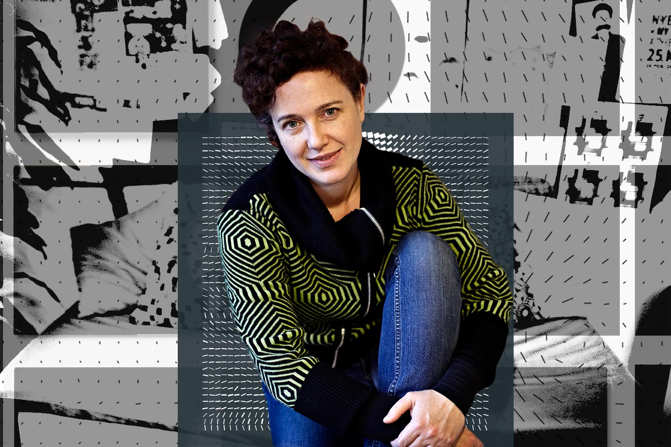
When Denise Burt started designing classical music album covers, she knew nothing about the music. And that might have been to her advantage.
by Tom Huizenga
Album art can be boring.
The old adage “don’t judge a book by its cover” hits close to home for graphic designer Denise Burt. Her job is making cover art for contemporary classical music albums. When she started in 2003 for Dacapo Records in Denmark, she says, she didn’t know much about classical music. But she did know the old-fashioned designs like this one weren’t working.
She began talking to composers about their work — and getting as experimental as the music.
More than a decade later, Burt has designed nearly 300 album covers for Dacapo and other labels. We asked her to explain eight of them. Here they are, followed by the music that inspired them.


1. Jexper Holmen, Oort Cloud
“Oort cloud” refers to an icy mass of objects at the outermost reaches of our solar system. The composer told Burt that the music, like the universe, “doesn’t give a damn about you.” Burt thought the album art should reflect that.


“So I took the name of the composer and the title of the work and put them through an online randomizer, which spit out a long line of gibberish.” She then filled 24 pages of the booklet with it.
One critic wrote: “If prizes were awarded on the basis of user unfriendliness, this CD would be in line for a Pulitzer.” That made Burt happy.

2. Vagn Holmboe, Chamber Music (1)
Burt couldn’t talk to Vagn Holmboe about his music. He died in 1996. But she did learn about his metamorphosis technique of composing — musical “cells” that mutate and multiply.


She found an image of bacteria and re-created the shapes with gaffers tape. “For the insert, I reversed the colors, because when you open the cover you meet something very different — and get a little shock.”


3. David Lang, Death Speaks
How do you depict death? There are a million cliches. Burt says she wanted to portray it as a friend: “Not an evil person coming to take you away, but someone to embrace and comfort you.”


She cropped in on an old photo from the Library of Congress. “The original picture itself is nasty!” she says. “But when you focus in on his hand on her shoulder, he has the most amazingly gentle touch.”
She added more images in the booklet to give the sense of “an unspecific and ambiguous journey.”

4. Anders Koppel, String Quartets
Burt intended this design to be an abstract representation of a symphony orchestra. “I wanted to represent each musician as a kind of beam of light,” she says.


But the composer felt it better represented his String Quartet No. 2, a work inspired by the northern lights. Burt’s design ended up on the cover of that album.

5. Per Nørgård, Libra
For Per Nørgård’s Libra, a song cycle about balance and harmony, the first thing Burt did was ditch the obvious: the astrological sign of the scales of justice. Instead, she found inspiration through data visualization.


“When I saw these organic branchlike forms,” she says, “I thought of Nørgård’s infinity series, a compositional technique where he works with musical motifs and repeats them like fractals.”

6. Pelle Gudmunsen-Holmgreen, Mixed Company
If this cover appears totally bland and random, that’s the idea. The composer “wanted something completely neutral,” Burt says. He wanted the image to be divorced from the music.


“It’s incredibly hard to find a picture that’s empty enough,” Burt says. This is a snapshot that she took with a flash of her old attic door. And it has nothing to do with this music.

7. Peter V. Swendsen, Allusions to Seasons and Weather
Peter V. Swendsen records ambient sound in odd landscapes to use in his music. For this cover, Burt collected photographs Swendsen had taken while making field recordings of the Norwegian landscape.


“They seemed like the most honest materials for the album art,” she says. She combined multiple photos into a collage, which “highlighted this feeling of being engulfed by weather, atmosphere and the things going on around you.”

8. Terry Riley, In C
Burt describes this cover as a grid of repeated short lines, each with its own gradual progression. It’s a reflection of Riley’s composition, the first big hit in the genre of minimalism, where music unfolds in organic patterns and players choose from among 53 short phrases.


“I had been working on this graphic idea of a wind-flow diagram,” she says. “I started to change the volume of the lines — in a kind of random but controlled way — and I thought that this would be a suitable minimalist motif to use on the CD.”

Seeing New Music
Denise Burt has compiled 24 of her favorite designs into a book, Seeing New Music, published by her design company. Along the way, she has listened to a lot of contemporary classical music.
“I had no idea that music could tell so many stories, so many ideas,” she says. “It’s made me a lot more open-minded.”
Burt knows she won’t be making CD covers forever. She says the format itself is not the point. “To tell a story about the music, make it accessible for people and maybe reach out for new audiences — that’s the exciting part.”


Project Credits
Reported by: Tom Huizenga
Produced by: Tyler Fisher, Becky Lettenberger, Wes Lindamood, Claire O’Neill
Photography: Peter V. Swendsen for Allusions to Seasons and Weather and Brian Arnold for the Death Speaks snow trail image
Special thanks to Denise Burt for sharing her work with us and to the following record labels for the use of their music: Dacapo, Cantaloupe Music, Ars Nova, Oberlin Music
Published on: 7/28/15
